Hello everyone,
What is your lactate threshold? Lactate threshold is a point where you start accumulating lactate as you increase intensity of exercise. It is good to know because you can customize your training based on the threshold. However, you may wonder how you can find it… This blog is for those who are excited about exercise and training control !!
Procedure

1, Import data
Data is inserted in the end of this blog, so you can download it below.
2, Find aerobic threshold
The aerobic threshold is a point where lactate production starts increasing. A common threshold definition is a point where blood lactate concentration increases by more than or equal to 0.5 mmol/L from the previous value. Let’s look at raw data and visually find the point…
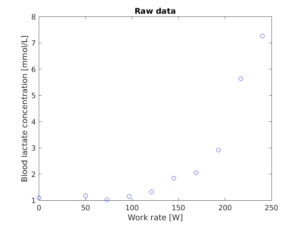
Maybe the gap between the 5th and 6th values is more than 0.5, so the aerobic threshold is the 5th. I am showing how to automatically detect the threshold on my YouTube video (Link is in the end of this blog).
Another way of finding threshold is log-log method. Its procedure is simple. You just need to log workload and lactate values. The plot looks like this…
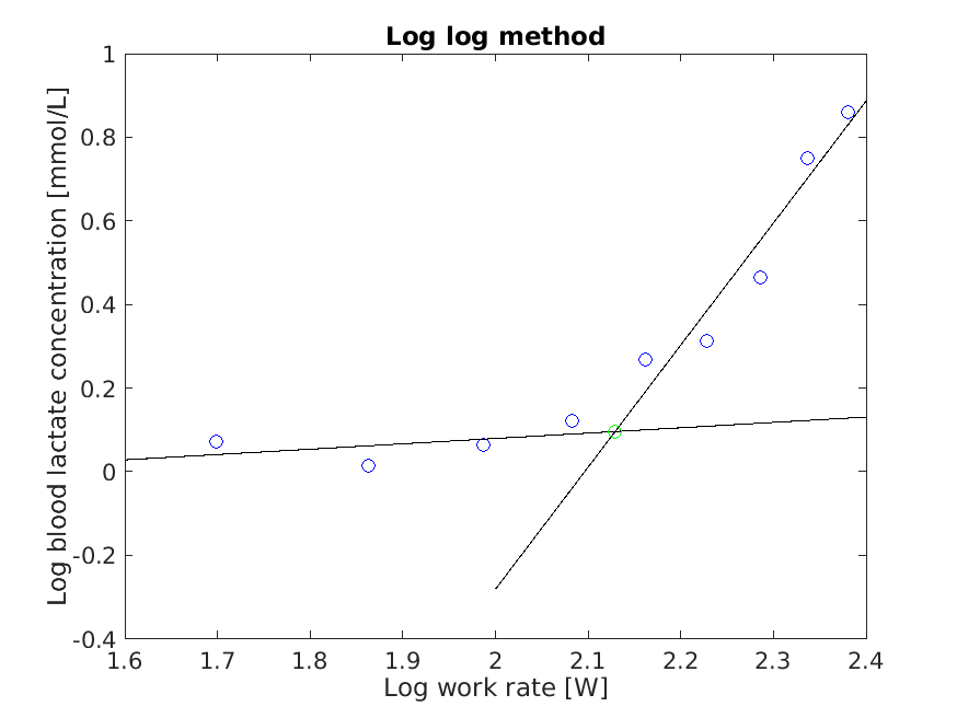
As you can see, the deflection point (A point where the lactate value suddenly increases) is more pronounced compared to the raw data plot. Then, I created a linear line from the first data point to the deflection point and another linear line from the deflection point to the last data point. The crossing point of the 2 linear lines is the lactate threshold estimated by the log log method. However, it is a logged value, so you have to bring it back to original value. I logged the value with base 10, so you need to do 10^whatever value to find the original value. Just eyeball estimation, logged workload and lactate value at aerobic threshold is 2.12 and 0.02. Then, I have to do 10^2.12 and 10^0.02 to get the original workload and lactate value at aerobic threshold. Both methods are fine to use, but for further analysis, I will just use the lactate threshold value estimated by the first method.
3, Create a lactate curve
As you saw the raw lactate data plot above, the data points are not linear. Therefore, we have to use some other methods to fit the data points. I will show you 5 different fitting curves.
Exponential curve
The equation of the curve assumes that the lactate increases exponentially. The curve looks like this …
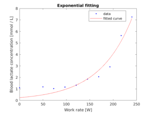
The equation is …
y = 0.2407*e^(0.01413*x)
Double exponential curve
The equation of the curve consists of 2 exponential equations. The curve looks like this …
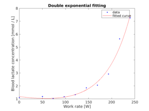
The equation is …
y = 1.097*e^(-0.005299*x) + 0.07599*e^(0.01895*x)
Polynomial curve
The equation of the curve assumes that the lactate increases polynomially. The curve looks like this …
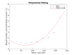
The equation is …
y = 0.0002077*x^2 + -0.02842*x + 1.621
Interpolation curve
Interpolation is just connecting data points. The curve looks like this …
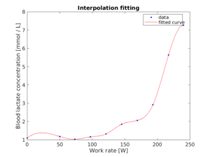
There is no equation for this …
Smoothing spline curve
The smoothing spline curve is a smoothed version of interpolation curve, so curve looks like the interpolation curve. The curve looks like this …
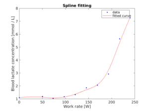
There is no equation for this …
By just looking at those curves, the double exponential curve seems the best so far. We would exclude interpolation and smoothing spline curves, because there is no equation for them, and those curves are not smooth compared to other curves. There is another way to find which curve is the best, which is error and r square values. Those values for each curve are below …
| SSE | r square | dfe | adjusted r square | rmse | |
| Exponential | 2.5189 | 0.9405 | 8 | 0.9331 | 0.5611 |
| Double exponential | 0.7674 | 0.9819 | 6 | 0.9728 | 0.3576 |
| Polynomial | 2.5466 | 0.9398 | 7 | 0.9227 | 0.6032 |
| Interpolation | 0 | 1 | 0 | – | – |
| Smoothing spline | 0.2122 | 0.9950 | 3.2576 | 0.9862 | 0.2552 |
SSE is a sum of squared error. It is a sum of squared distance between the curve and actual values. The bigger value, the worse.
r square is a coefficient of determination. It is a percentage of deviation between the curve and actual values. The bigger value, the better.
dfe is degrees of freedom in the error. The degree of freedom is a number of datapoint – 1. Then, the dfe finds how many data points of actual values are not on the curve. The smaller value, the better.
Adjusted r square is an adjusted version of r square. The adjustment is based on degrees of freedom. The bigger value, the better.
rmse is a root mean squared error. It is like the sse, but instead of taking a sum of the squared error. it takes a root and mean of the squared error. The bigger value, the worse.
The table says that interpolation and smoothing spline have very good values, but we cannot estimate values from the curve because we do not have an equation of the curve. Then, the double exponential is the best since it has lower errors and bigger coefficients of determinant compared to the exponential and polynomial. Therefore, I will use the double exponential curve for further analysis.
4, Find anaerobic threshold
There are many ways to estimate the anaerobic threshold by using the estimated aerobic threshold and lactate fitting curve we found in the previous steps. I will explain the estimation method one by one.
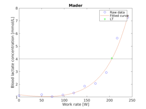
Mader method
The definition of this method is 4 mmol/L, so when blood lactate concentration reached 4 mmol/L, that is anaerobic threshold. It is very simple. The plot looks like this …
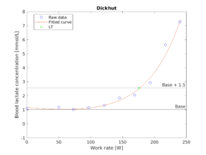
Dickhut method
The definition of this method is the minimum lactate value + 1.5 mmol/L. First of all, we need to find the minimum lactate value, which would be around 1. Then, we just need to add 1.5, and the value is the anaerobic threshold. The plot looks like this …
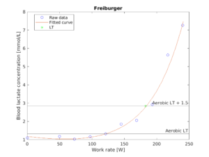
Freiburber method
The definition of this method is an aerobic threshold + 1.5 mmol/L. It is similar to the Dickhut method, but instead of the minimum lactate value, this method uses the aerobic threshold which we already found in the previous step. The plot looks like this …
Dmax method
The definition of this method is the biggest perpendicular distance between a lactate curve and a linear line from the first to last lactate value. It would be easy to imagine if you look at the plot first. The plot looks like this …
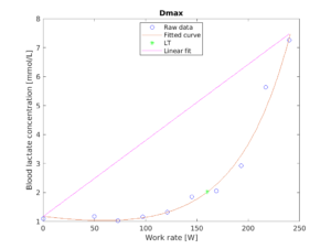
The green asterisk is the point where the perpendicular distance between the curve and linear line is the biggest.
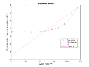
Modified Dmax
The definition of this method is the biggest perpendicular distance between a lactate curve and a linear line from the aerobic threshold to last lactate value. It is similar to Dmax method, but this method uses aerobic threshold to draw a linear line instead of the first lactate data point. The plot looks like this …
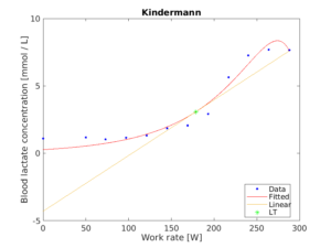
Kindermann method
The definition of this method is the sharpest linear line from the recovery lactate value to lactate curve. In this method, we have to include recovery lactate values which are lactate values after the exercise was finished. Therefore, we have to fit the curve again. As you can imagine, the double exponential curve is the best this time as well. Then, the linear line starts from the point where the recovery lactate value drops to the same value where the exercise is finished. Usually, the lactate value increases even after the exercise. Then, it drops. My lactate value did not drop to the point where the exercise was finished (I could not recover well), so I just take the last lactate value. From the lactate value, we need to draw a line to each data point in the lactate curve. The data point which we could draw the sharpest line is the estimated anaerobic threshold. The plot looks like this …
All estimated anaerobic threshold on a plot
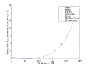
As you can see, the value is different in each method. We can use any method, but we should stick to one method to compare the value inter-personally or intra-personally.
The aerobic and anaerobic threshold value is useful for training control. For example, if you want to train your endurance capacity, you can run with the pace where is at your anaerobic lactate threshold. In my case in Freiburger method, I would train around 180W.
My YouTube video
I am explaining all procedures above on my YouTube video, so check it out !
MATLAB code and lactate data
Enjoy !!


If you want to use the photo it would also be good to check with the artist beforehand in case it is subject to copyright. Best wishes. Aaren Reggis Sela
The photo is from copyright free resource. The plots were made by me.
A round of applause for your article post. Really looking forward to read more. Really Great. George Beaufort Addie
Thanks !
If you want to use the photo it would also be good to check with the artist beforehand in case it is subject to copyright. Best wishes. Aaren Reggis Sela
The photo is from copyright free resource. The plots were made by me.
Hi there mates, fastidious article and pleasant urging commented here, I am actually enjoying by these. Tallie Abdel Nadab
Hey There. I found your weblog using msn. This is a really well written article. Davina Isacco Thorley
Good article! We are linking to this great content on our site. Keep up the great writing. Maiga Paulo Markson
I’m extremely pleased to discover this website. I wanted to thank you for ones time just for this fantastic read!! I absolutely enjoyed every part of it and i also have you bookmarked to see new stuff in your site.
Definitely, what a great blog and revealing posts, I definitely will bookmark your site. Best Regards!
I got what you intend,bookmarked, very decent website.
I reckon something truly special in this website.